
LOGO DESIGN
D2 Studios Graphic Design create logos that enhance your businesses image and set the stage for its growth.
Logos needs to be eye catching and simple, innovative.
Your logo gives the first impression of your business. It is the visual illustration of your business and its values
At D2 Studios Graphic Design we Dress your business for success .
Packages range from $1500 for a complete logo and Corporate Identity package
to $500 for a simple logo update.
Contact us for more specifics included in the packages.
|
DESIGN NOTES FOR DIVERSE CITY THEATER LOGO D2 Studios Graphic Design was commissioned to rebrand the 4-year old NYC based Diverse City Theater Co. with a logo that would be recognizable at-a-glance and iconic. Because of the project’s complexity, it was necessary to have in-depth discussions with the company’s executive committee before any initial designs could be created.
We submitted multiple design concepts and discussed their merits. After much experimentation, we decided to keep a typeface similar to the original logo but with a more modern flair. The black and red colors where chosen for the type to reflect a well-established company. The mask, long being symbolic of live theater, was chosen as the main graphic. By adding a multi-colored patchwork we successfully conveyed the company’s mission: to present plays concerning under represented subjects of diversity and employing “color and race-blind casting”. 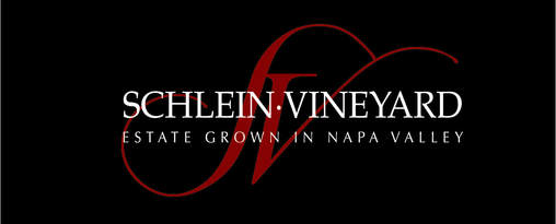
DESIGN NOTES FOR SCHLEIN VINEYARDS LOGO AND PACKAGING Design a timeless yet upscale logo, packaging and business cards
for this high-end family owned estate vineyard in Napa Valley, CA. A half dozen rough designs were submitted for consideration with several incorporating images including grapes and vines. The curves of the lettering in the final logo subtly suggest the rolling hills of the vineyard. Continuity was provided as the design element was also employed for the labels on the bottles as well as other packaging. 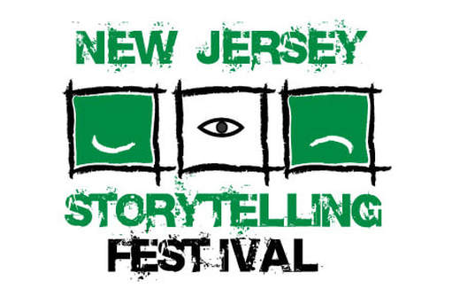
DESIGN NOTES ON THE NJ STORYTELLING FESTIVAL LOGO
Project: The New Jersey Storytelling Festival has used a different logo in each of its sixteen years of operation. D2 Studios suggested that it would be best to have a permanent logo upon which they could build their brand. We wanted to convey the art of storytelling, the connectivity to emotions that it creates and the concept that theater truly began with the spoken word.
Solution: The logo was designed using basic symbols. The eye represents the eye contact between the story teller and the audience, while at the same time adding an air of mystery. The smile and frown symbolize emotions that are inherent in every story. Also, the boxes enclosing each image are miniature stages. This style of design is indicative of children’s’ or “primitive” drawings because oral traditions contributed greatly to the “dawn of learning.” |