
BROCHURE DESIGN
D2 Studios designs brochures that mean business?
Brochures can be focused on either attracting new client or supplying interested ones with detailed
information.
Each type has its own unique way of communicating with the client and when done effectively
can translate into your bottom line.
At D2 Studios we make sure the focus of your brochures speak to the right people.
DESIGN NOTES FOR FEMSA BROCHURE & CORPORATE LITERATURE
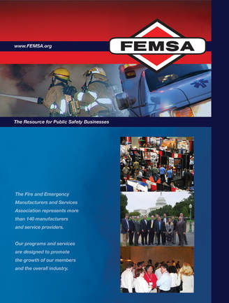
Updated all printed and electronic literature, corporate ID, and signage for The Fire and Emergency Manufacturers and Services Association. FEMSA represents over 140 companies and needed a new “look” that equally represented the fire and EMS industries.
The initial design process included concepts incorporating various images from both the Fire and EMS sectors. After consideration we decided that it would be best to tie all the collateral pieces together by using the image created for their new website. After that decision was made it was just a matter of adapting the artwork for the pieces that needed to be produced.
The initial design process included concepts incorporating various images from both the Fire and EMS sectors. After consideration we decided that it would be best to tie all the collateral pieces together by using the image created for their new website. After that decision was made it was just a matter of adapting the artwork for the pieces that needed to be produced.
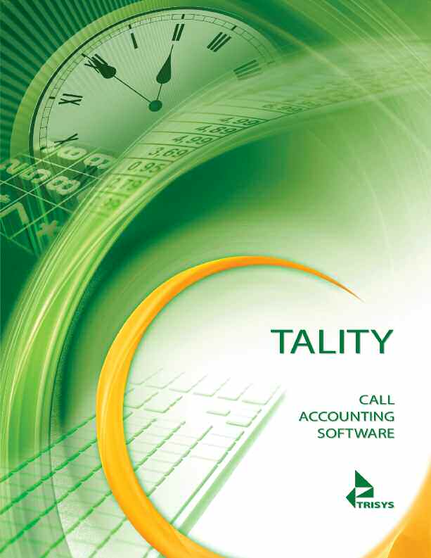
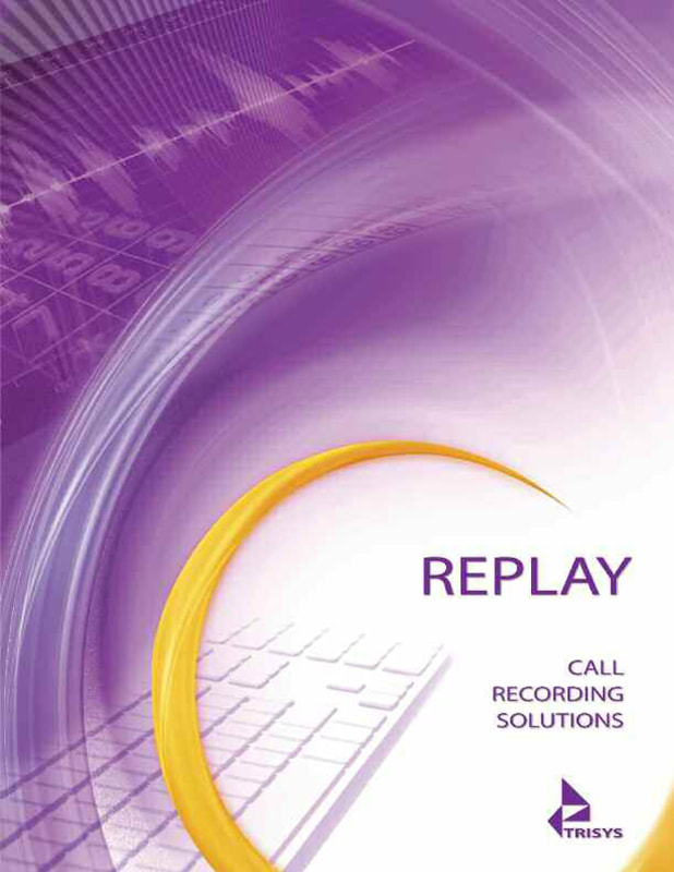
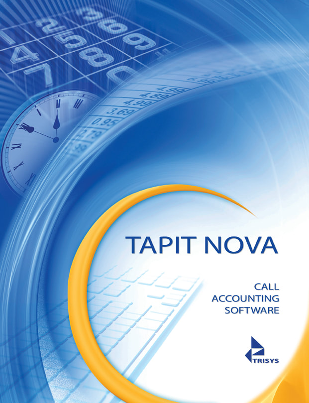
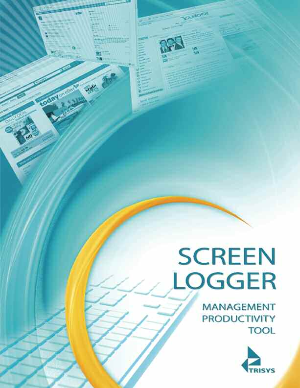
DESIGN NOTES FOR TRYSIS PRODUCTS BROCHURE (4 ) PLUS DVD COVER
|
|
|
|
Redesign product line literature and DVD covers while building an overall brand image. Trisys represents the industry standard in call accounting and call recording software. Its products are used by Fortune 100 giants, school systems, leading universities, hospitals and government agencies.
Because this is a hi-tech company, we chose a futuristic look that conveys a sense of cutting-edge achievement. Each of the four products employs visual elements keying into the software function, color coding by product finishes the product “line” look.
Because this is a hi-tech company, we chose a futuristic look that conveys a sense of cutting-edge achievement. Each of the four products employs visual elements keying into the software function, color coding by product finishes the product “line” look.